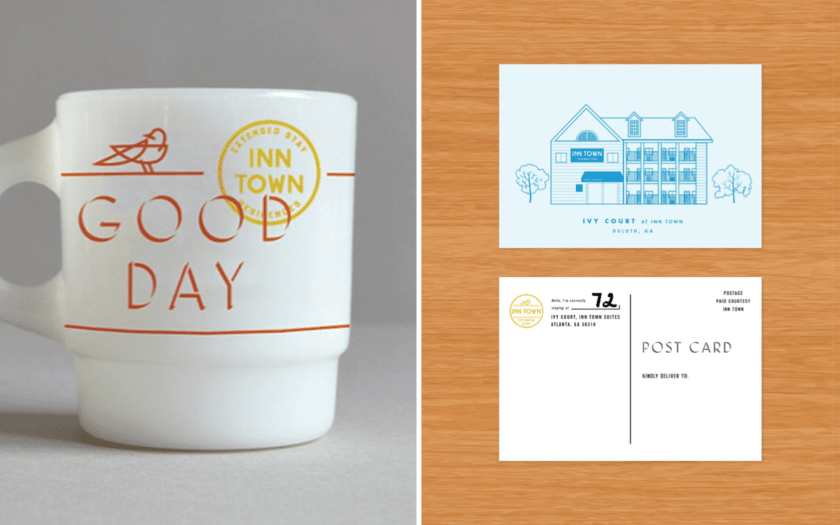
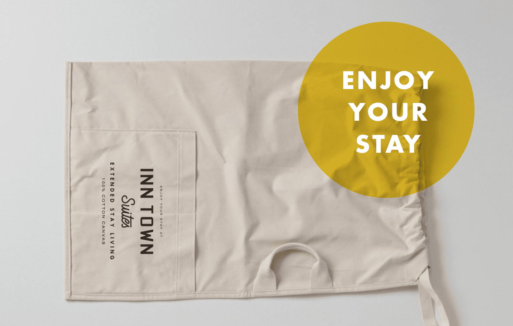
InTown Suites was a tired chain of value-priced extended stay properties that was ready for a reboot. BREAD was brought on by the CEO of a real estate company that had recently acquired the collection of assets. He aspired to breathe new life into the stagnant brand, to refresh it both visually and emotionally.
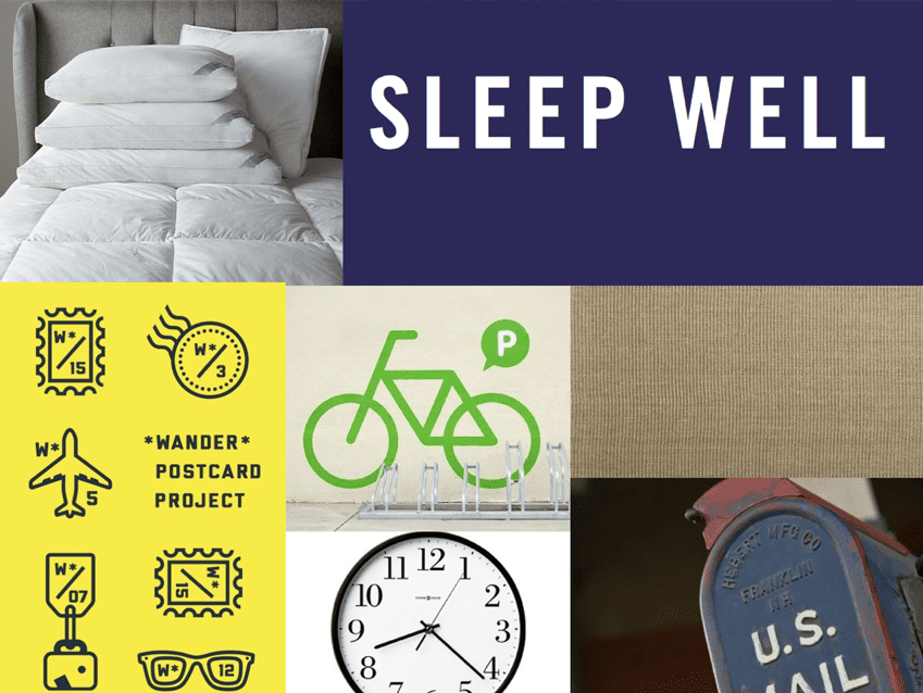
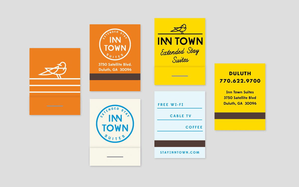
We created a new fresh logo and chose a bird as the icon, symbolizing both a place to nest, and offering the freedom to explore.
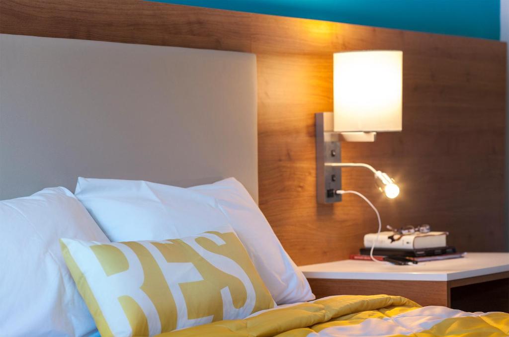
We then assembled a team of interior architects to value engineer a facelift for the existing properties, carefully balancing the needs of the consumer with the design goals of our client.
Brand Refresh
Re-Positioning Strategy
Graphic Identity Re-Design
Led the Room Re-Design initiative
Creative Way Finding Strategies