Food/Beverage

Grass R(x)oots

Developed by a physician and a concerned mom, Grass Rxoots is a fun, healthy eatery on a serious mission. The founders engaged BREAD to help create unique branding for a grab + go juice and food company with strong community involvement.

A red background with white lettering that says grass roots and an underground movement.

BREAD was challenged with inventing a brand that would at once communicate serious nutrition… while giving off a fun fresh vibe.

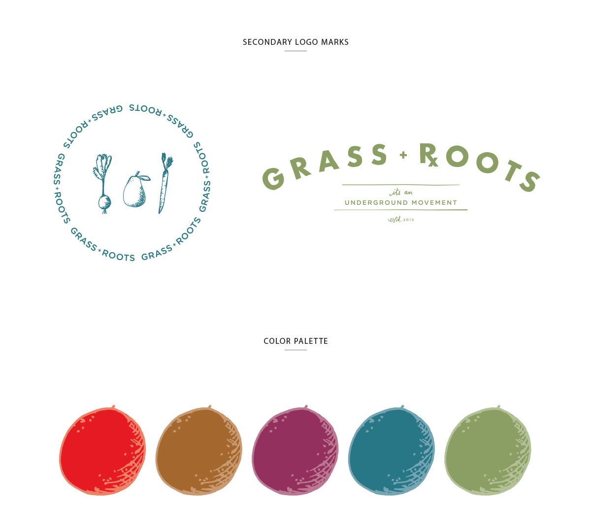
A series of color swatches for grass roots.
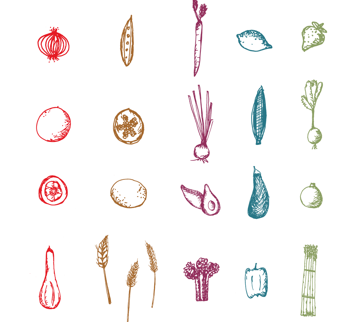
A set of different vegetables drawn with colored pencils.

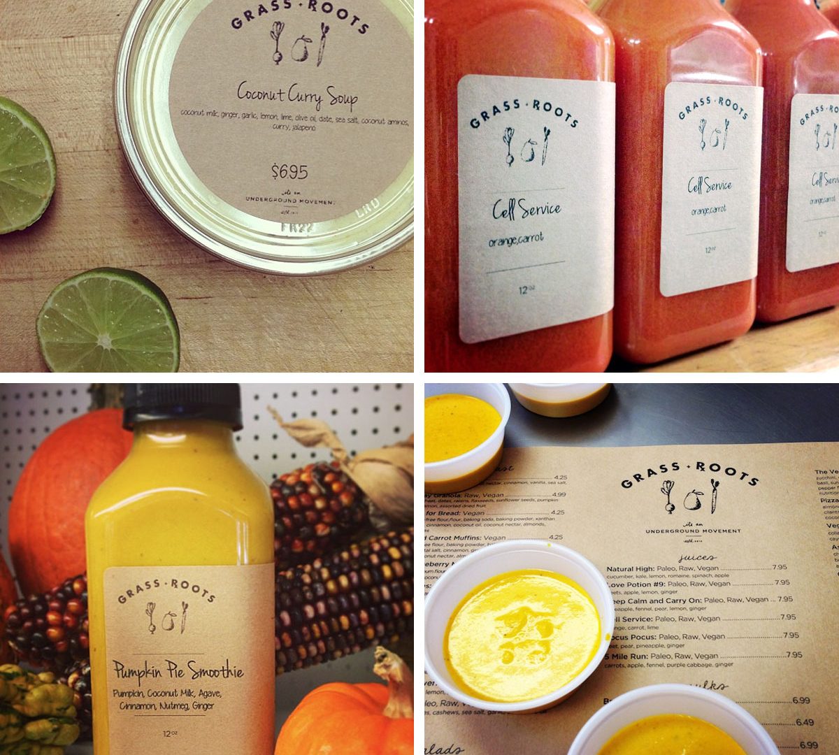
Every juice announced their attributes in a memorable way…“Five Mile Run,” increased stamina…“Lovely Bones,” was rich in calcium and vitamin D…“Natural High” energized. 

A collage of four different images with juice and fruit.

Everyone calls the store “Grass Roots,” but the “x” in Rxoots speaks to the involvement of an MD in creating evidence-based wellness recipes.

A pile of fruits and vegetables that are in the picture.

Vision + Project Management Services

Naming
Strategy + Positioning
Graphic Identity
Product Development
Interior Design Consulting
Product Development
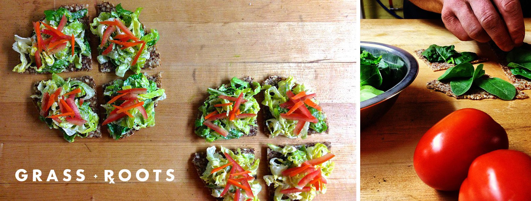
A wooden cutting board topped with some pieces of food.

Grass Rxoots opened in Old Greenwich, CT and quickly became a fan favorite among serious juicers and casual health nuts alike!

See other projects